Hania Ayman

Illustrated portrait of Hania Ayman
Name
Hania Ayman Abdelaziz
Position
UX/UI Design Lead | Development & Innovation Manager
Focus
Websites, apps & design systems
Based in
Cairo, Egypt · Open to remote

I lead UX/UI and digital projects from the first sketch to the developer handoff: research, wireframes, prototypes, design systems and the microinteractions that make a site feel crafted. I direct designers, work closely with developers, and keep every screen tied to the business goal behind it.

Selected Work

fourseedesign.com

The website for FOURSEE Design Studio. I led it from A to Z: sketches, wireframes, prototype, design system and core screens, then directed the mobile and iPad design, the microinteractions, the developer handoff and the Contentful CMS.

Creative & UX/UI leadDesign systemBooking + admin portalContentful CMS
thisisaliveandwell.com

An online store for a design-led furniture brand rooted in Danish design. The full shopping journey, from categories and filters to cart and checkout, carries the brand's bold, warm personality.

E-commerceShopping journeyFilters, cart & checkoutBrand-led UI
natindamiddleeast.com

A Korean skincare brand whose products each came with different packaging and branding. I designed a web branding system that gives every product its own identity, colour and shapes, held together by one set of components.

Web brandingProduct identity systemComponentsSkin quiz
cosparkai.com

An AI learning platform on a mission to make Egypt a leader in AI-powered education. I created the brand and designed the UX/UI, from the public website to the student dashboard, tests and flashcards.

BrandingUX/UIEdTech & AIStudent dashboard
athear.com

A corporate website for a pioneering outsourcing company working across the MEA region. One modular system presents five business units, from customer experience to managed workspaces, with the clarity and trust multinational clients expect.

Corporate B2BMulti-service architecturePage templatesTrust & scale

The app for Egypt's first local brand boutique, redesigned after the Locally rebrand. I consulted on how the app should be built out, designed its core screens and UI kit, then led the team through execution and development.

Mobile appBrand to UIUI kitTeam lead
This is RoutedWellness brandComing soon

About

Hello, I'm Hania

UX/UI Design Lead and Development & Innovation Manager, taking digital products from strategy to launch. With roots in graphic design, my focus today is building design systems, leading creative teams and bringing AI into how we design and deliver. The aim is always the same: clear, thoughtful experiences that work for users and for the business.

Download CV

Expertise

  • UX/UI Strategy & Design
  • User Research & Prototyping
  • Design Systems
  • Art Direction & Visual Identity
  • AI Integration in Design
  • Team & Stakeholder Leadership
  • Design Workshops for Entrepreneurs
  • Business Development

Tools

  • Figma
  • Adobe Creative Suite
  • Contentful
  • Relume · Miro
  • Lovable
  • ChatGPT · Claude · Nano Banana
  1. FOURSEE Design StudioUX/UI Director & Development and Innovation Manager2023 – Now
  2. HAJEELA TravelCo-Founder & Experience Operations Manager2022 – Now
  3. Kairo for IdeasGraphic Designer2022 – 2023
  4. Potato App, ScotlandUX/UI Intern (Remote)2021 – 2022
  5. EarlierKreativstorm Berlin · @Hotel Platform · DOT MarketingBefore 2021
Let's make cool stuff together

All work
Case study

This is FOURSEE

A website for a multidisciplinary design studio that shows its work, explains its services, and lets clients book the photography studio online, run from a CMS the studio manages itself.

Client
FOURSEE Design Studio, Cairo
My role
Creative & UX/UI lead, end to end
Team
Me, a UX/UI designer I directed, and a developer
Live
fourseedesign.com
fourseedesign.com

The brief

FOURSEE needed one site to do three jobs: show the studio's work through projects and case studies, present its services from design consultancy to photography and animation, and take bookings for the photography studio without back-and-forth messages.

Behind the public site sits an admin portal for managing those bookings, and every project, case study and service is published through Contentful, so the studio can keep the site current without a developer.

What I led

  1. Sketches & wireframesMapped the structure and key journeys: browsing work, reading a case study, exploring services, booking a shoot.
  2. PrototypeBuilt a clickable prototype to test the flows and align the studio before visual design.
  3. Design system & componentsCreated the style guide: typography, colour, 12-column grid, buttons, inputs, cards, lists, pop-ups, loaders and the illustration set.
  4. Creative direction & core screensDesigned the full desktop website and its core screens.
  5. Mobile & iPadHanded the system to a UX/UI designer to extend it to mobile and iPad, and led her through to handoff.
  6. MicrointeractionsArt-directed every interaction on the site, from the loading screen to hover states and transitions.
  7. Developer handoffHanded over the designs and worked with the developer through the build.
  8. CMS & adminOwn the Contentful CMS and the booking admin portal, and publish the site's content.

Key features

Work & case studiesProject pages and long-form case studies that tell the story behind each brand.
ServicesEvery discipline in one clear list, from concept and branding to media buying.
Studio bookingClients choose a date, people, equipment and hours, then confirm in one form.
Admin & CMSAn admin portal for bookings and Contentful for all site content.

Booking flow

Click to open
01Plan the shoot Date, people, equipment and contact details.
02Pick a time Choose hours and a start and end time.
03Confirmed A hand-drawn thumbs up and an email confirmation.

Motion

Loading screen
Loading screen

While the site loads, the studio's hand-drawn icons (a star, hands, a pencil and a lightbulb) play out one by one before landing on the FOURSEE wordmark.

Design system

Scroll sideways · Click to enlarge

Neue Montreal type scale, a colour palette per studio unit, 12-column grid, form states, buttons, cards, list rows, pop-ups, loaders and a hand-drawn illustration set.

Screens

Hover to scroll · Click to open
Home
Photography studio
Studio booking
Project page
Case study
All work
Case study

This is Alive and Well

An e-commerce website for a design-led furniture brand, built so that shopping for furniture feels as personal and expressive as the pieces themselves.

Client
Alive and Well, Egypt
My role
UX/UI design
Type
E-commerce website
Live
thisisaliveandwell.com

The brand

Alive and Well is a design-led furniture brand born in the in-between, where taste meets impulse and function meets feeling. It rejects mass production and copy-paste interiors, curating furniture and living objects that are personal, expressive and intentional.

Rooted in Danish design principles but reinterpreted through a bold, sensory lens, the brand makes pieces that give a space character: furniture designed to be lived in, felt and remembered.

The approach

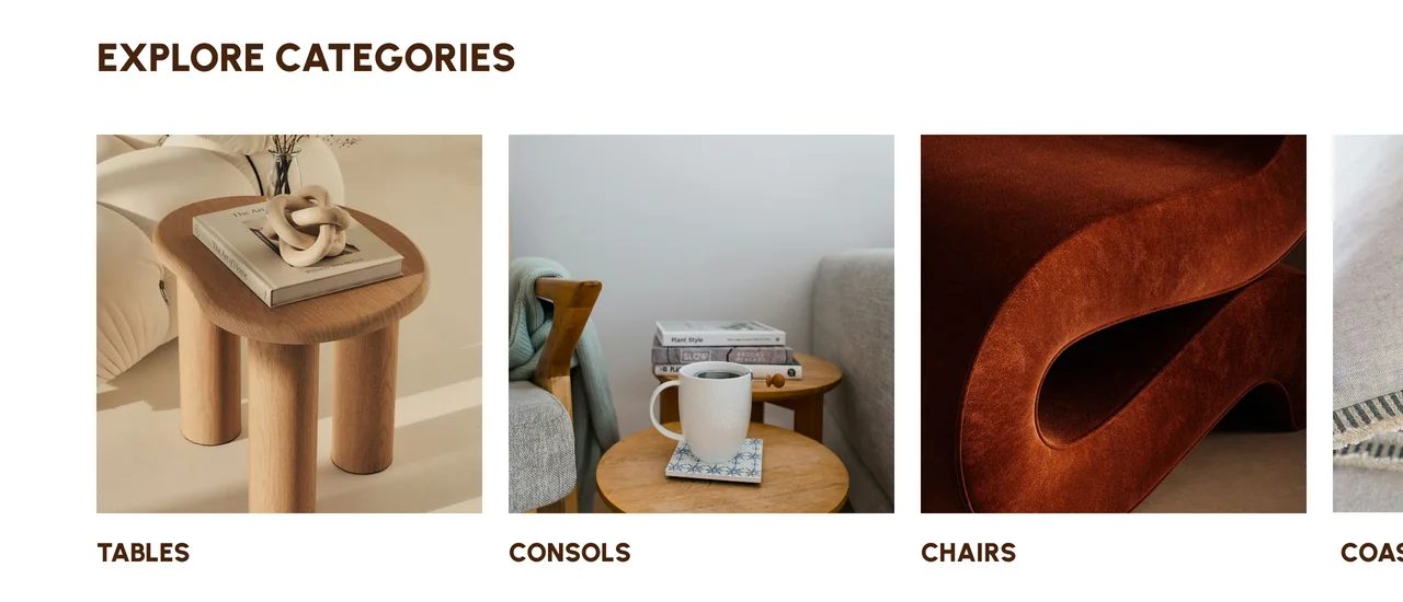
The website had to sell furniture and still feel like the brand. The UI takes its cues from the identity: heavy rounded type, a warm palette of rust, butter yellow, sage and deep brown, and the brand's chair-shaped marks used as icons and accents.

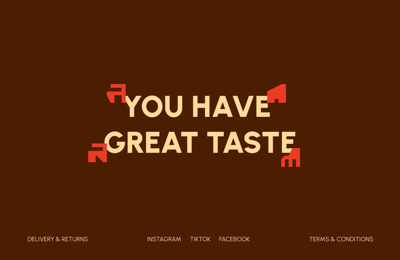
Even functional parts of the store keep that personality. Form fields are filled in butter yellow, calls to action are rust red, and every page closes on the same line: "You have great taste."

The shopping journey

NavigateA full-screen menu that opens product categories alongside a featured image.
SearchA focused search screen with popular searches to get people started.
Browse & filterCategory pages with a filter panel for colour, collection, material, seaters and a price range.
ProductColour options, add to cart, expandable details, materials and care, and related products.
Wishlist & cartHearts save pieces to a wishlist; the cart opens as a side drawer with quantities and subtotal.
Checkout & feedbackOne-page checkout, then clear success, error and empty-cart states in the brand's own icons.

Hover states

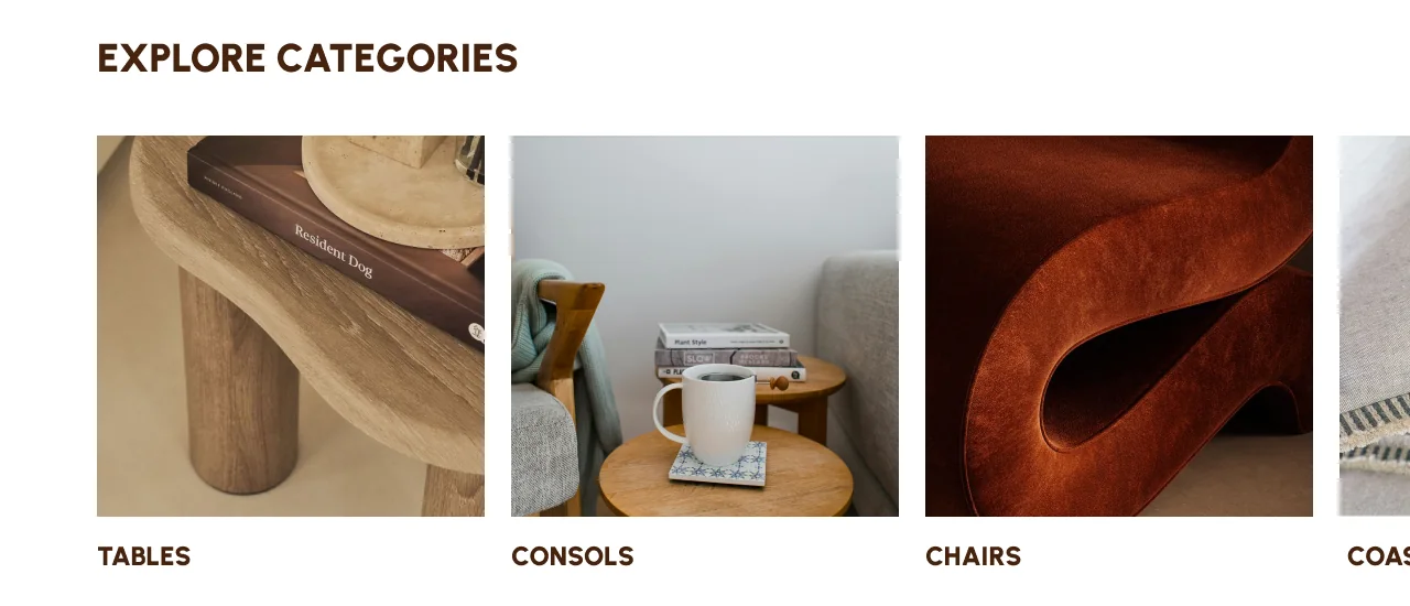
Explore categories at rest
01At rest Each category shows its product.
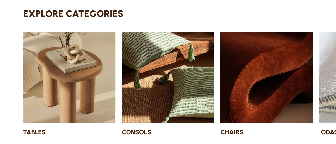
Tables category on hover
02Hover · Tables The image swaps to a styled close-up.
Consoles category on hover
03Hover · Consoles Every category swaps to a styled scene; nav links and icons turn rust red.
Footer at rest
04Footer at rest The chair marks frame "You have great taste".
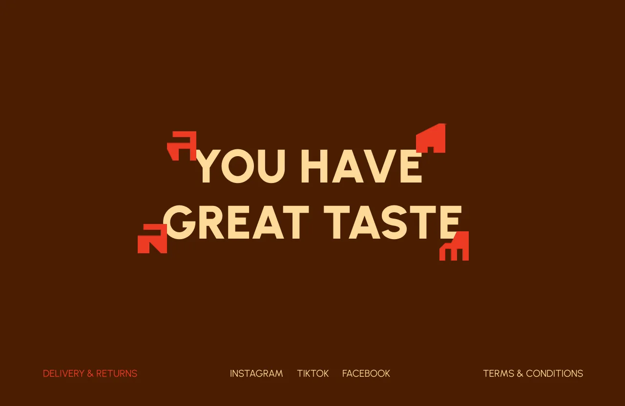
Footer link on hover
05Hover · Footer Links turn rust red and a chair mark shifts position.

Screens

Hover to scroll · Click to open
Home
Products
Filters
Product page
Wishlist
Order placed
Error state
Newsletter pop-up
About
Collaborations
Mr. Mots is Alive
All work
Case study

This is Natinda

An e-commerce website for a Korean skincare brand bringing K-beauty to the Middle East, with a web branding system that gives every product its own identity.

Client
Natinda, K-beauty for the Middle East
My role
Web branding & UX/UI design
Scope
Product identity system, graphic elements, components, e-commerce UX
Live
natindamiddleeast.com

The challenge

Natinda's products did not share the same branding. Each one arrived with its own packaging, colours and style, so putting them side by side on a website risked looking inconsistent.

Forcing them into one look would have erased what made each product recognisable. The site needed to celebrate the differences and still feel like one brand.

The idea

I approached it as web branding: a dynamic system where every product behaves as if it has its own brand. Each one gets its own colour, drawn from its packaging, and its own organic shape that sits behind the product.

That identity then flows into the components around it: the rating hearts, the ingredient ticks, the add-to-cart button and the product panels all take on the product's colour. A shared type system, a serif display with italic accents over a clean sans body, and one set of components keep everything reading as Natinda.

The product identity system

Hover a product
Calming Refresh Cleansing FoamCleanser · Beginning of the routine
BlobHeartsButton
Atticos 24K Gold AmpouleSerum · The middle
BlobHeartsButton
Multi-Stick Moisture CareMoisture stick
BlobHeartsButton
Multi-Stick UV CareSPF stick
BlobHeartsButton
Calming Sherbet Cleansing BalmCleansing balm · The end
BlobHeartsButton
Pour Le Cellule Whitening CreamMoisturiser
BlobPanelButton

Each product's colour and shape carry through the blob behind it, its rating hearts, ingredient ticks and add-to-cart button.

Key experiences

Skin quizA quiz that identifies skin type, then builds a personalised results page, shown here for dry and oily skin.
Personal routineResults explain the active ingredients, then lay out a routine from morning to night: The Beginning, The Middle and The End.
Product pagesDetails, how to use, why we love it, who it's for, FAQs, full ingredients, a hero ingredient and a "Pair it with" suggestion.
Reviews that rewardCustomers leave reviews and earn points, feeding the VIP Squad loyalty programme.
Trust at a glanceIcons for allergy tested, no animal testing, dermatology tested, paraben free and suitable for all skin types.
Brand storyA brand page with Values, Promise and Story tabs: "Your reflection, redefined".

Screens

Hover to scroll · Click to open
Skin quiz results · Dry skin
Skin quiz results · Oily skin
Product page
Home
Brand page
All work
Case study

This is Locally

A shopping app for Egypt's first local brand boutique, redesigned to carry a bold new identity from the street into every screen.

Client
Locally, Egypt's first local brand boutique
My role
App consultant, core screens & design lead
Scope
App structure, core screens, UI kit, team leadership through development
Platform
Mobile app

Screens

Hover to scroll · Click to open
Home
Product listing
Product page
Account
Empty cart
Error state

The brand

Locally is Egypt's first local brand boutique: youth-driven, unapologetic and inclusive, built to prove that local isn't limited. It curates the country's most exciting emerging brands, a retail space turned cultural movement that takes Cairo's creativity to the world.

The facelift gave it a bold yet clean system: an enhanced logomark, a playful wordmark and a slanted "L" for speed and movement. Geometric shapes drawn from Talaat Harb Street, where local brands first came together, anchor the identity, with a bold RGB-inspired palette against pastel hues that recalls the early digital era. Arrows, stars and angled blocks act as street-born markers.

What I did

  1. ConsultingAdvised on how the app should be fleshed out: its structure, features and flows.
  2. Core screensDesigned the core screens after the rebrand, translating the new identity into the app.
  3. UI kitBuilt the components the team would scale from: type, colour, grid, icons, buttons, cards, pop-ups and more.
  4. Team leadershipLed the team through executing the remaining screens and developing the app.

From street to screen

The identity's energy carries into the interface. Slanted italic headings echo the "L", the bold RGB blue leads every action, and a red accent is kept for discounts and errors.

Pop-up icons are built from the identity's own shapes: angled blocks for the empty cart, a star for loyalty points. Every product card carries a badge of the local brand behind it, so the app celebrates the makers as much as the products.

Key experiences

DiscoverAn announcement bar for drops and sales, a hero, and categories to scroll through.
BrowseProduct cards with discount badges, the local brand's badge, wishlist hearts and a clear out-of-stock state.
ProductA swipeable gallery, brand and colour details, and a sticky quantity and add-to-cart bar.
Account & pointsOrders, loyalty points, address book and notifications in one place.
Helpful statesFriendly empty states and "Oops!" messages that explain exactly what to do next.
One tab barHome, shop, products, videos and account, always one tap away.

UI kit

Scroll sideways · Click to enlarge

Logotype and logomark, shapes, pop-up icons, a full icon set with states, typography, colours, a 12-column grid, button scales, inputs, dropdowns, tab bar, date picker, product and cart cards, pop-ups and image sliders.

All work
Case study

This is Athear

A corporate website for a pioneering outsourcing company, built as one modular system that makes five business units easy to explore and easy to trust.

Client
Athear, outsourcing across the MEA region
My role
UX/UI design
Type
Corporate B2B website
Live
athear.com
athear.com

The client

Athear is a pioneering outsourcing company delivering end-to-end solutions, from IT and business process outsourcing to managed workspace services. It operates across multiple sites in the MEA region, works in four languages, and was the first in Egypt to launch cloud-based customer experience solutions.

Trusted by multinationals and major corporations, Athear combines innovation, scale and certified quality to meet business needs.

The challenge

A corporate audience needs to understand quickly what a company does and whether to trust it. Athear offers many services across five business units, each with its own functions and processes, so the site had to stay clear as the content grew.

It also had to feel modern and confident without losing the seriousness that multinational clients look for.

The approach

One services menuA full-width menu lists all five units: Business Process, CX and HR Outsourcing, the FOURSEE Design Unit and Managed Workspace.
Repeatable templatesEvery unit uses the same page structure: an introduction with a photo, its functions, how it works, and FAQs.
One card componentA cream card with an orange rule and arrow carries services, processes, SDGs and news, so every section reads the same way.
Proof up frontHeadline figures such as headcount, seats, key clients and countries served, plus partner logos, answer "can they deliver?" on the home page.
A calm, confident lookDeep navy, one orange accent for actions, wide uppercase headings and black-and-white photography that unifies very different office shots.
Beyond servicesCareers, news and a Responsibilities page with Athear's SDG action plan show the company behind the services.

Screens

Hover to scroll · Click to open
Services menu
Service page
Service detail
Business unit page
Responsibilities & SDGs
News
All work
Case study

This is Cospark

A brand and product for an AI learning platform that makes studying more personal, accessible and effective for every student.

Client
CoSpark AI, Egypt
My role
Branding & UX/UI design
Type
AI learning platform: website & student dashboard
Live
cosparkai.com
cosparkai.com

The mission

CoSpark AI is on a mission to revolutionise learning through AI, making education more personalised, accessible and effective for every student.

Its ambition is bigger than one product: to position Egypt as the future capital of AI education, leading the global shift to intelligent learning systems rather than watching from the sidelines.

The brand

I built an identity that feels smart but friendly, more study buddy than textbook. A rounded lowercase wordmark with an underline bar, a deep forest green paired with a bright lime, and pill-shaped buttons with a small arrow dot give it energy without losing focus.

The wordmark grows to an oversized "cospark" that bleeds off the footer, and hand-drawn study objects such as a compass, flask and globe give each subject its own character.

The student experience

Show, don't tellThe home page opens on a live-style chat, so visitors see the AI explain, summarise and quiz before they sign up.
Ask firstEven the login screen invites students to "Ask Cospark", keeping the product's core action in view.
Progress at a glanceThe dashboard shows study time, correct answers, completed chapters and a learning streak, with a summary by subject and recent activity.
SubjectsIllustrated subject cards show chapters, study time and MCQs, with one clear button to enrol.
Focused testsTimed MCQ tests show one question at a time, with progress, previous and next, and the option to continue later.
FlashcardsA stacked deck for quick test prep, built for both deep dives and quick sprints.

Screens

Hover to scroll · Click to open
Student dashboard
Subjects
MCQ test
Flashcards
Login